
The Gini coefficient is a measure of the degree of inequality in a distribution, and is commonly used to measure income distribution.
These few words alone are enough to grasp the extraordinary importance of this index for economic and political studies, and why it is worth getting to know it a little more closely.
What We’ll Cover
Income is a transferable variable.
A quantitative variable is said to be transferable when the overall increase in the phenomenon recorded across a given population can be redistributed among the statistical units without changing its total amount.
The index is one of the greatest achievements of Corrado Gini, one of the foremost Italian statisticians (who was unfortunately personally connected to the fascist regime. He inspired Mussolini’s famous “Ascension Day” speech of 1927 on the issues of birth rates and eugenics).
It was in 1912 that Gini published his article “Variabilità e mutabilità” (Variability and Mutability), in which he expanded on the work of Max Otto Lorenz, who as early as 1905 had introduced the famous curves (now known as “Lorenz curves”) describing the percentages of wealth held by increasing percentages of the population.
The Lorenz Curve
Lorenz introduced a highly effective graphical representation, placing on the horizontal axis the points Pi (that is, the cumulative fraction of the first i income earners: Pi = i / n) and on the vertical axis the corresponding values Qi (the cumulative fraction of income held by the first i income earners). Connecting these points produces the concentration curve, known as the Lorenz curve.
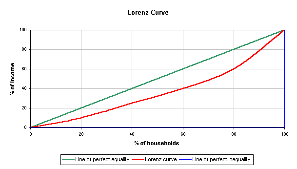
The difference between Pi and Qi measures, in proportion, the share of total income that the first i individuals lack in order to reach a state of equal distribution.
The larger this difference, the more the remaining n − i individuals concentrate a significant portion of the total amount on themselves.
The measure of income inequality is the arithmetic mean of the normalised differences (that is, of the quantities Pi − Qi / Pi, for i = 1, 2, 3, …, n − 1).
Gini thus managed to develop, in his 1912 work and then in 1914, “his” coefficient, which measures the percentage of the area between the given curve and the 45-degree line, relative to the area between the latter and the flat curve.
In practice, it indicates how much the corresponding Lorenz curve deviates from complete equality in the distribution of wealth.
In one sentence: the ratio of the area of concentration to its maximum (which is 0.5) coincides exactly with R.
An Example
Let us build the Lorenz curve: the vertical axis shows the income percentages of households, while the horizontal axis shows the percentages of households.
If 30% of households earned 30% of the income, 40% of households earned 40% of the income, and so on, we would have a perfectly equal distribution — that is, a straight line at 45 degrees.
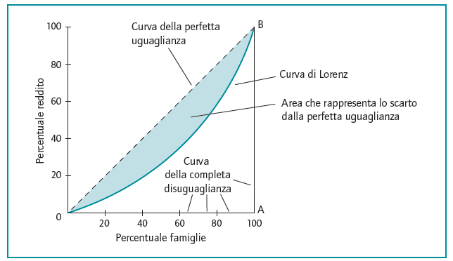
The Lorenz curve instead represents the actual distribution of income: the deviation of the Lorenz curve from the line of perfect equality (that is, from the 45-degree line) constitutes the measure of inequality in income distribution.
The ratio of the area between the line of perfect equality and the Lorenz curve (that is, the shaded area in the figure) to the area of triangle 0AB is the Gini coefficient.
The Definition of the Concentration Index R
R can be defined independently of the Lorenz curve: it equals the normalised simple mean difference divided by its maximum, that is:
\(R = \frac{\text{mean absolute difference}}{2 \times \text{mean of values}} \\
\)
R is therefore an index expressed as a number between the theoretical values 0 and 1 — theoretical because they correspond, respectively, to the case of perfect equity in wealth distribution (everyone has the same income) and the case of maximum inequality (a single unit holds all the income). It is a “pure” value that allows comparison between different countries or territorial areas, proving extraordinarily useful in the field of socio-economic analysis.
Computing R… in R!
Countless R libraries contain a function for calculating the Gini index (the most widely used package is probably “ineq“, easily found with a search on CRAN), which is not included among R’s base functions.
However, since the calculation itself is not particularly complex, we find it useful to present a version of the function below.
1 – We start by computing the mean absolute difference
Delta <- function(variable) {
  n <- length(variable)
  avg <- mean(variable)
  sorted_variable <- sort(variable)
  (4 * sum((1:n) * sorted_variable) / n - 2 * avg * (n + 1)) / (n - 1)
}
2 – Now obtaining the Gini concentration ratio is just one line!
gini <- Delta(variable) / (2 * mean(variable))What If I Don’t Use R?
Fair point. R is a fantastic tool, but not everyone uses it. An index as important as Gini can be useful to many people who do not deal with statistics every day and are not familiar with R. The most universal and widespread programming language, even among non-programmers, is Python. Naturally, as with R, there are many possible implementations of the Gini coefficient, but in this case too, doing it ourselves is simple and instructive.
The solution we liked best comes from a post on planspace.org — here is the function, 8 lines in all:
def gini(list_of_values):
    sorted_list = sorted(list_of_values)
    height, area = 0, 0
    for value in sorted_list:
        height += value
        area += height - value / 2.
    fair_area = height * len(list_of_values) / 2.
    return (fair_area - area) / fair_area
First, the function sorts the list of values in ascending order. Then, it uses a for loop to compute the height and area of the Lorenz curve.
The height is calculated as the cumulative sum of the values in the list, while the area is computed as the area of the trapezoid between the current value and the previous value in the list. The total area of the Lorenz curve is then calculated as half the total height of the curve multiplied by the length of the list.
Finally, the Gini index is computed as the difference between the “fair area” (half the total area of the Lorenz curve if there were no inequality) and the actual area of the Lorenz curve, divided by the fair area.
Gini Index Values Around the World
- For a general overview, we can visit the website of the Organisation for Economic Co-operation and Development (OECD).
- A comparison of values across European countries is provided by Eurostat.
- On the ISTAT website it is possible to compare Gini index data across the various Italian regions.
You might also like
- Descriptive Statistics: Measures of Position
- Descriptive Statistics: Measures of Variability
- The Data: The 4 Scales of Measurement
Further Reading
For a brilliant, accessible exploration of statistical thinking—including how inequality measures like the Gini coefficient help us understand the world—The Art of Statistics by David Spiegelhalter offers a masterful blend of rigour and clarity.